Working with a real-world client in a three-week agile-based design sprint. Researched and designed a mobile app that can help users decide what to eat and save their time making grocery lists.
Design Sprint
UX/UI Design
Mobile App

In the past year of the pandemic, many people are forced to stay home and cook at home. My client is one of them. After a few weeks of home cooking, he runs out of ideas of what to eat and is tired of spending time on planning meals and organizing his grocery list.
I conducted the competitive research, ideated solutions, designed and prototyped a mobile app that reflects the client's goal and user's needs, and tested the prototype with target users.
· Young professionals
· Age between 25- 45
· Middle or higher income level
· Care about the nutrition and the balance of their food
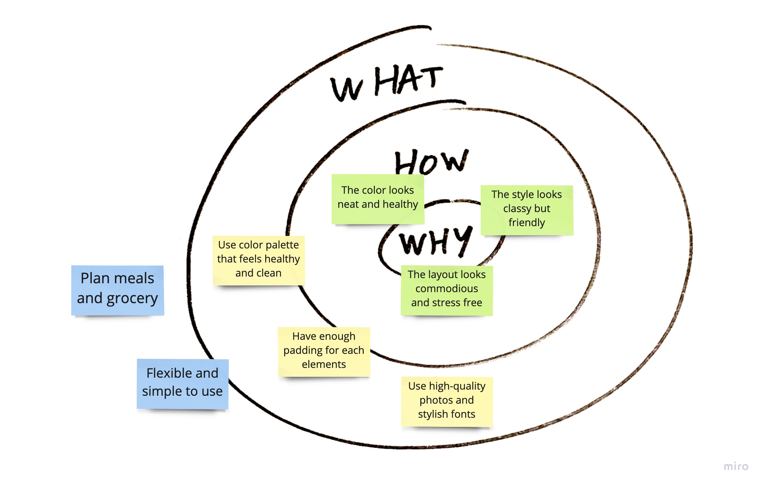
The idea is to create an app that can help users save time on deciding what to eat and save time on making a grocery list, which includes planning meals based on the ingredients that a user has in storage, recipes feed based on a user’s eating habits but with some innovative suggestions and, generate a grocery list.
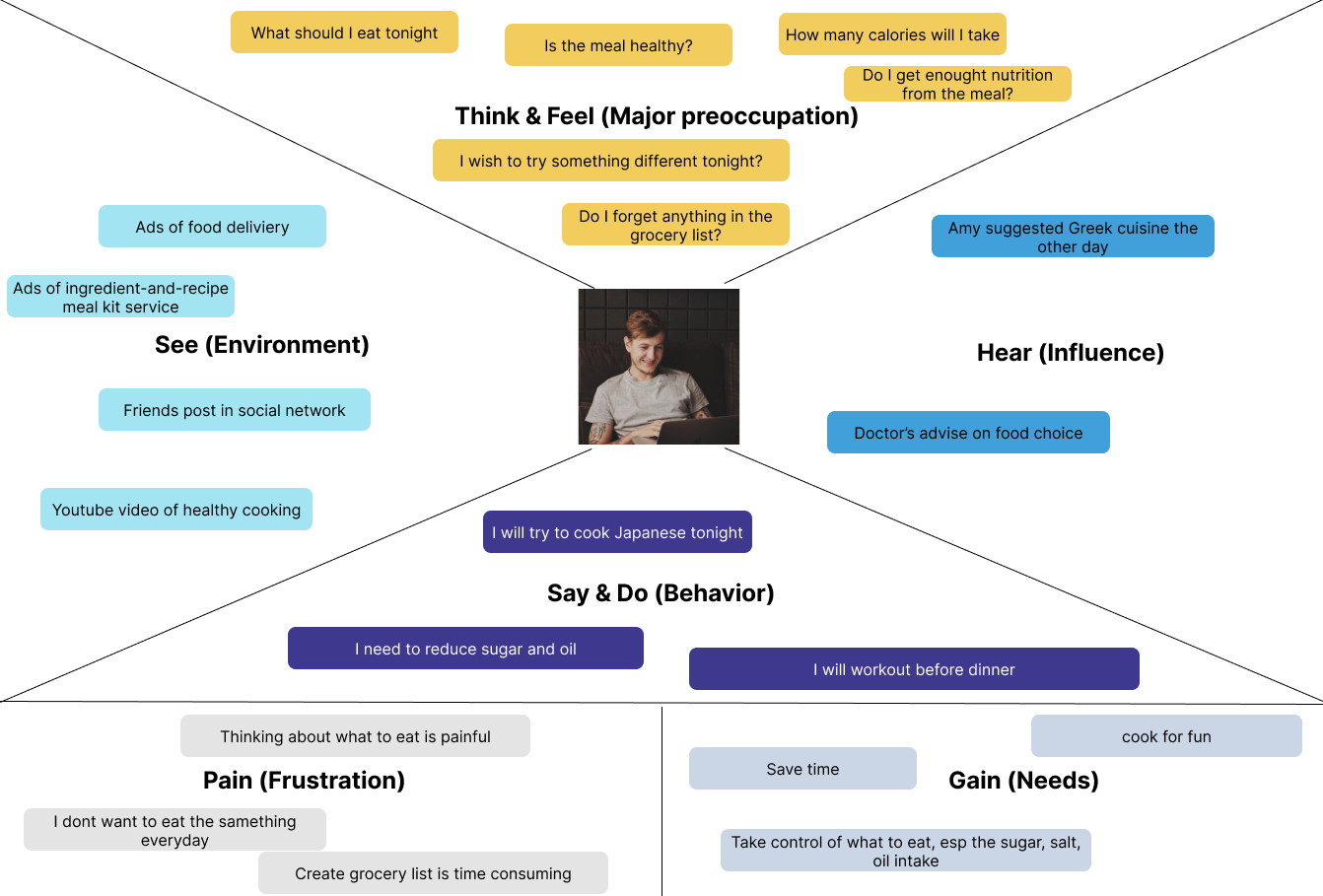
By interviewing my client, who also represents the target users, I learn about the needs, concerns, and pain points of the target users:
· Cares about what he eats every day include the nutrition facts, calories intake, and the combination of different ingredients.
· Would like to cook but doesn’t want cook to take too much time.
· Would like to have some sort of routines but still want to try something new.
· Want to save time in meal and grocery planning.
I used How might we (HMW) to turn each problem I could assume into opportunities and identified key problems l need to solve for my client with this app product.
Then, I organized similar ideas and labeled themes as they emerge, and narrowed down the top three HMW problems I focus on this sprint, which are Recipe Feeds, Plan Meals, and Generate Grocery Lists.

I researched more than ten meal planning and recipe feeding apps. Among them, I took a deeper look into the best two: Mealime, Yummly.
Meets the basic needs of my client, which feeds new recipes, generates meal plans, and creates grocery lists at the same time.
1. The recipe exploration is embedded in the meal plan. It is not in the navigation bar. Users have to go into the meal plan page and select the floating “Start your next meal plan” to explore the recipes. It is not friendly to the users who only want to explore recipes with the ingredients they have.
2. One step for generating a meal plan and grocery list. Combining the two tasks in one action takes fewer steps, but it can feel a little hasty for users who may want to separate the steps.
3. The calendar mode of the meal plan requires the user to schedule each meal, which is time-consuming.
4. Not flexible for users to create their own recipes.
Present nutrition facts of each dish.
1. It focused more on the recipe and instruction rather than planning.
2. It embeds the adding to grocery list into each recipe, and users can add each item into the grocery list by their choice.
3. The page for saving personal preference requires users to complete a quiz to collect user’s preference, which is not friendly to people who don’t have a preference or doesn’t want to take time for a quiz.
4. Not flexible for users to create their own recipes.

Jason lives a healthy lifestyle and work out at least three times a week. He cares about what he eats every day and would like to take time to cook. He prefers healthy ingredients but wishes to try some different cuisine with the ingredients he used to have. He also would like to try new ingredients if it’s healthy.
Goals and Needs:
· Save time in creating a nutritious meal plan for the week.
· Save time in creating the grocery list.
· Get recipe feed based on his preference.
· Have the calorie and nutrition fact calculate for him.
Hesitation and Pain Points:
· Thinking about what to eat is painful.
· Plan balanced meals is hard.
· Forget to buy ingredients if not list out beforehand.
· Make grocery list is time consuming.
I created the empathy map and user journey map to visualize and understand the user's mental model.

As a person who wants to cook a meal,
I will pick a few ingredients I have in storage and search for recipe with the ingredient,
So that I can try something new.
As a person who wants to prepare for grocery shopping,
I will spend some time to decide on what dishes I’m going to cook in the next few days,
So that I can buy all the ingredients I need during the grocery shopping.


I reflected on the navigation structure of the two major competitors. I think it makes more sense if exploring recipes in the same hierarchy as meal plan and grocery list. The preference in setting and favorite recipes can be combined into a personal page.
And to keep the bottom navigation bar from overcrowded, I intend to move the search box to the top, which has been made a norm in other app designs.

I also compared how Mealime and Yummly present their recipe details.
Mealime includes the cooking time, servings, cookware, ingredients, and instructions on the detail page. Everything but the cookwares seems necessary. Since our product is not selling cookware, cookware can be mentioned in the instruction, which doesn’t necessarily put into a separate column.

Yummly presents similarly. It includes a shopping button and presents the nutrition facts as well. Since my client has no intention to include shopping as part of the product, the shopping will not be necessary on this page. And because the target audience would care about the calorie intake and the nutrition fact in each meal. I decide to include nutrition facts into my design.

This is the recipe detail of my design. Users can see the details, such as cooking time, servings, ingredients, instructions, and nutrition facts. And if the user finds the recipe they like, they can add it to their meal plan or save it as a favorite.

First, I wrote down the essential ideas on what I've learned and what I planned to incorporate into my design.

Then, I created some rough doodles to visualize the major parts.

Developed a more detailed sketch of
1. How to collect user's preference;

2. How to duplicate a dish;

3. Where to add new recipes.
I considered the font size and the size of the touch targets. Then I translate the sketch into digital wireframes with Figma.
These show the flow of how users can explore recipes with the option of narrow down their choices by their preference.

This is when users want to find a recipe with the ingredients they already have and add a recipe on their own.

This is where users can check and edit their Meal Plan. The app will automatically schedule the dishes based on nutrition facts and calories. Users can still choose to cook the same dish for another time by clicking on the duplication button or reschedule a dish to a different time as they wish by click on the reschedule button.

This is where users can see and edit the grocery list once the grocery list is generated. Users can use the top right plus button to add other items to the list. Users can also check to cross out the thing they already have or don’t want.

With the prototype, I conducted three user interviews with the target audience.
Among three users, one is male, and two are female. The age is between 25-35 years old. All the users cook at home, and two habitually create a grocery list before grocery shopping. One of them used to use apps to plan and track meals and calorie intake.
· Explore recipes and be able to narrow down options with filter
· Search for recipes with ingredients
· Add recipes into the meal plan
· Create a recipe
· Duplicate a recipe in the meal plan
· Reschedule the recipe in the meal plan
· Generate and edit the grocery list
“It's a good app to help you stay organized, to plan ahead, and see those items when you go grocery shopping.”
“I like the simplicity of it. It's cool that all these subcategories right at the beginning of it when you first come in. It is easy to find things.”
“I think it's a cool App. The layout looks easy to understand. I like it.”
“It's hard to think what else features to add. Because It's good. I'm happy with it.”
As for tasks, most of them are very easy for users to accomplish. Such as adding a recipe to a meal plan, rescheduling a dish to a different time, creating a new recipe, generating and editing the grocery list.
However, to duplicate a dish in the meal plan, among three users, two think the duplication button is difficult to recognize, and one user thinks it's intuitive to use.
“ I think the calendar is not necessary.”
One of the users thinks the calendar is not necessary. I’ll be more cautious about this feature and test it with more users to see if the calendar is necessary.
“I hope that I can choose servings when put a recipe into a meal plan.”
Another user brings up the need to choose servings when to put a recipe into a meal plan. I think this is an excellent feature to add on. Even though the user can see the serving details on the detail page, it will be better to make the "serving" an option and flexible.
Through the observation, I also learned that:
1. Users can confuse Filter with Search.
2. When editing the grocery list, users couldn’t realize the shortcut of recovering an item, even though this doesn’t affect how they use the product.
3. Users would like to see a column of recommendation based on their user history.
There will be three changes included in next iteration:
1. Add a Column of Recommendation in Home Page.
2. Make the Duplication Button More Intuitive to all.
3. Make changing servings available when adding to the meal plan.
Keeping the user persona in mind, I listed out my design purpose, process, and the problem I was trying to solve.
I collected pictures from well-known recipes websites and social media to create a mood board to set up the Interface design style.

With the mood set, I redesigned the welcome page and designed a Logo as App Icon.


The main focus at this stage is to resolve the issues revealed during the user test.
During the user test, two think the duplication button is difficult to recognize among three users, and one user thinks it's intuitive to use. I took the inspiration from my mailbox for Flagging or Trashing an email. Users can swipe to see duplicate and delete options and to make the duplication more straightforward in a recipe app context. I changed it to "Cook Again."

Since the app will automatically schedule the meal plan for users based on nutrition facts and calories, it's essential to give the user an option to reschedule. I decided to Reschedule visible before swiping.

I also came up with several ways to let users change servings at this stage. Finally, I chose this design to keep the card simple and easy to understand.

I explored several ways to give responses when users take actions.
1. Respond to changing servings
The first option provides users with an unlimited number to choose from by tapping the plus or minus icon. The second option has a limited choice of servings, but the downwards arrow is more compatible with this option.


2. Respond to adding recipes to Meal Plan
The first option requires users' reactions, which produces a more robust notification. The second option will popup at the top for 3500ms and dissolve, which notified the users more subtly.


After a preference testing with multiple users, both option two won the test.
3. Make the hidden shortcut visible
In the previous prototype, users couldn't realize the shortcut of recovering an item when editing the grocery list. The original inspiration was from the checklist in Apple Note. Once the item is selected, it will move to the bottom of the list. I change the design to make a recovery more visible to users. The first iteration adds tips to clarify the shortcut. The second iteration gives up moving the item down, which turns out to be more straightforward and intuitive.


I learned a lot through this project.
First, this design sprint was a present-heavy process. Through this process, I honed my storytelling skills by presenting my work to my stakeholders and client.
Second, I learned the importance of user research. For this project, I only did a competitive analysis and didn’t conduct quantitative user research at the beginning of the project. By the end of the design, I realize there’s not much data to support my decision. I learned that I should always collect data and use data to ground my designs.
