Brownies are household spirits or fairies from Scottish folklore. They are helpers with chores around the house.
This app is designed to help people save time by hiring others (Brownies) to run errands for them.
Mobile App
UX/UI Design

It can be exhausting to balance work and life, especially for working parents and young professionals. By reducing household chore time, people can feel more satisfied. Also, during the year of the pandemic, many people avoid going out. So the problem I was trying to solve here is: How might we reduce the household workload and make running errands easier?
Inspired by Uber and Airbnb, I came up with the idea of designing an app that can help people save their time by hiring others to run errands for them through a sharing service.

My process includes four major phases: Discover, Define, Develop and Deliver. The process is not linear. It can go back and forth between different phases.

At the beginning of the project, it’s essential to define the project scope. Since it’s my project without any client, I decided to conduct primary research on available apps, such as TaskRabbit, Errand It!, Fetch.com, and Uber, that solve similar problems or apply a sharing service business model. I organize my notes into groups:
1. Categories of the errands;
2. As a user, what are my concerns?
3. As a service provider, what are my concerns?

Then, I list out questions I need to know to create an app that helps people hiring others to run errands for them:
1. Who is interested in this?
2. How often would people use this type of service?
3. What specific services do I include?
4. How much money would people pay for this service?
5. How people rate each factor in billing, including hourly rate, distance, urgency, item size, and item value.
6. How do users feel a person is trustworthy enough to complete their errands?
7. How can runners trust the customer not to have them do something illegal in a sharing service model?
24 people participated in the survey. Below is the breakdown analysis based on the survey result.

The users’ top three needs are: to shop grocery, pick up food from a restaurant/ dinner that doesn’t deliver, and fetch and send items between family or friends. I decide to prioritize these three features in further development.
The top-rated three factors in billing is the hourly rate, distance, and urgency.
The top rated user concerns are: item loss or broken, reveal personal information, price and speed.
More than 83% of users will set the baseline at or under the validated user who signs up as an errand-runner, which proves this sharing service model is feasible.
To generate user personas, I separated the ten users who need help with errands at least twice a month, which is 10 users.

Among them:
60% of users are in their 30s or 40s, 30% of users are in their 20s.
60% of the users are female and 40% are Male.
60% of the users are white American.
80% of the users have bachelor or higher education.
60% of the users are mid or higher income family.
70% of the users are employed.
70% of the users are single, and 30%of users are married.
90% of the users have no children. 10% of the users have 2-4 children.
Based on the survey result, I created two personas. They both live a busy life and need a hand on daily chores, such as shop groceries, pick up food, and laundry.

"It will be great to have someone to help me with my daily chores."
Amy and her husband have two kids: a teenager and a 9-year-old. They need to take care of the children and work full time at the same time. It's hard to balance work and life, and there are always tons of chores waiting for her.
Goals and Needs:
· Fetch or send items between family or friends
· Shop grocery
· Pick up wine/spirit
· Have the calorie and nutrition fact calculate for him.
Hesitation and Pain Points:
· Worry about item loss or broken
· Doesn’t want to reveal personal information
· Afraid of the service would be too expensive

"I just want to rest after work."
Daniel lives by himself. His high-paying job also gives him much pressure. He always feels exhausted after work. He'd rather paying someone to do the laundry and grocery shopping than do it himself.
Goals and Needs:
· Send/pick up dry cleaning
· Shop grocery
· Pick up food from a restaurant/dinner that doesn't deliver to him
Hesitation and Pain Points:
· Worry about item loss or broken
· Doesn’t want to reveal personal information
· Afraid of the service would be too slow
· Worry about the shopper not picking quality items e.g. bad produce
With the two personas in mind, I conducted a more detailed competitive analysis with Fetch.com, TaskRabbit, Errand it! And Uber Connect.

I also create a user flow for each competitor.

I group the users to new users and returning users and list out the tasks they want to complete.

For new users, it's essential to see what services are provided, the procedure, and the price range. They also need to feel trust through the brand.
For returning users, it's essential for them to feel personalized and convenient for use.
I separated the user journey into five stages and create a user flow for each stage.


Then I categories the necessary pages and created a site map.

I sketched different versions and chose the best to translate into wireframes and iterated during the process.

Among the three versions. I chose the the third version because it separates the landing page that shows the brand and a login page for users to login.

When creating the wireframe, I replace the login through other platforms buttons with smaller icons to reduce clutter feelings.

I choose the first version of the sketch because categorizing the six services into groups is unnecessary. And when making it into the wireframe, I refer to TaskRabbit and decide to add a price range for users' convenience.
Since shopping grocery is the most demanded service by users, I decided to visualize this feature first.

I chose the second version of the sketch because it separated each step and made each page easier to read. And since urgency is one of the top-rated factors in billing, I decided to include an urgent service schedule.

In creating the wireframes, I decided to include multiple ways to attach the shopping list for the user's convenience and list the extra charge of urgency service for the user's reference.
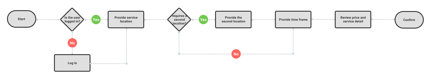
I also wanted to present the service flow that includes two locations and the user experience as a returning user.

I created the sending item pages base on the new user's flow. The significant difference is returning users can see saved addresses and payment methods for easy use.
I sketched out the payment screen. Then I thought about the different flow between new users and returning users. So I created separate select payment pages for returning users.

Since distance is another major user-voted factor in billing, I decided to include the distance both on the map and in fare breakdown to show users that they are fairly charged.

I sketched out the page for the ongoing errand and rethought the flow. Then, when creating the wireframe, I added a page of selecting runners to make users feel they are in charge of the service.

I thought about Uber, Airbnb, and other sharing services. It's necessary to contact the runner directly for further communication during the service. And there will be an automatic charge and receipt after service. It asks for user's feedback for other user's references. So I sketched out these pages and made them into wireframes.

Since I use the name Bownie as the product's name, I wanted to get inspiration from brown and fairies or elves.


Above is the first version of my logo and onboarding pages. However, the test result shows that it looks childish and doesn't make users feel trustworthy.

So I made the second version which I kept the color palette, abandon the idea of using elves as the mascot, but took the perspective of the service I'm providing. Test results showed this version makes them feel trustworthy.
After testing the color contrast, I incorporate the color palette and add a few additional pages to make a smooth prototype.


With the prototype ready, I conducted a user test. The test is trying to understand the user's experience at each stage. And experience as a new user and as a returning user.

I deployed the test through Maze and received feedback from 16 people.
Through the landing page, more than 75% of the user feel the brand is trustworthy.

-"I really love the coloring and the way the different brown colors come together.”
-"Looks fun, inviting conveys the message well."
Users are asked to find someone to buy groceries for them as new users.
Positive feedback includes feeling intuitive, smooth, comfortable, and attractive.
-"Awesome!!! It feels smooth, intuitive. I’m not sure what could be improved."
-"Super intuitive. I liked the spacing of everything, and I feel really comfortable within the app."
-"I think the layout is attractive, clean, and intuitive."
Some critics point out the unnecessary steps and adding a payment is easy to miss.
-"I didn't like that when I clicked Joe's Market, I then had to click next. It seemed like an unnecessary step. The other steps felt intuitive."
-"Adding a payment was easy to miss."
Users are asked to find someone to send a box of puzzles for them as returning users.
Positive feedback includes feeling simple, clean, minimal, and avoiding confusion. The summary and map act as a plus.
-"I like the summary and map of where the person who ran the errands went."
-"This looks great, the steps are easy and seem that they belong there, UI is clean and minimal, avoiding confusion."
-"Simple & clean design, intuitive process.
One critic pointed out the summary feels a bit messy.
-"Errand Summary feels a bit messy :)"
Users are asked to select the runner and contact the runner by message and call.
Most users feel positive about the experience.
-"Very cool!"
-"The steps flowed well. I liked the easy to see icons."
Some critics prefer Errand's name to the runner's name for reference on My Errand Page, and one user suggests adding a call button on My errand page.
-"The errand name would be more helpful than the person's name & picture when trying to contact."
-"I think maybe have a call button/icon at the first box before having to go to messaging first would feel a little better."
Users will receive a receipt and will be asked for rating and optionally tipping the service.
One user suggested combining the receipt and the tipping page for users to calculate the tip better.
-"It was also pretty intuitive. It would be nice to see my total, tip, and new total on the same page. In my head, I want to know what percentage I am spending on tip compared to the total."
In general, the product was a success. Users think it's simple and straightforward, and they appreciate the reference to folklore.
-"The steps were intuitive and flowed well.
-"Liked it a lot!"
-"I like it and appreciate the reference to folklore."
-"Clear and efficient."
-"Simple and straightforward. looks great"
With the feedback from the users, I focused on three major areas to improve. Reduce unnecessary steps, redesign errand summary page and My Errand page.

For choosing the store page, I removed the unnecessary button and added an arrow as an indicator.
For attaching the shopping list page, I remove the Next button and redesign the page's layout.

Inspired by the Lyft receipt, I redesigned the Errand summary page to make it better organized.

I incorporate the users' feedback of switch the hierarchy of Errand's name and runner's name and adding a call button. I also think about the complicated situation when the user decides to cancel the service, so I replace the cancel service to get help.

I combined the two after-service pages into one and added a product logo to the page. And to keep consistent with the page during the service. I added the get help link on this page as well.
Here’s the UI inventory I created for this product.

I learned a lot through this project, especially defining the MVP scope since there's no specific business requirement at the beginning of the project. I constantly remind myself of the major problem I try to solve and the core feature I want to present. I enjoyed getting inspiration from the best companies and business models and finding solutions. I'm glad that most testers like this product, and I will keep incorporating the feedback and suggestions into future iterations.